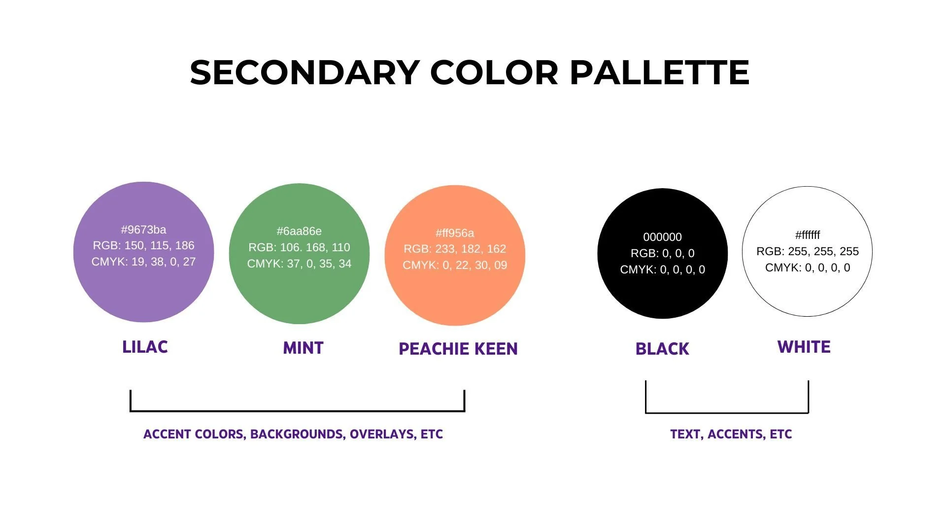
Brand system + identity design

client: spiritual Organization | Campaign: believe. belong. become.

the problem

A messy visual identity was making a meaningful message hard to recognize and even harder to maintain

many hours were being spent redesigning instead of creating visbility and effective communication.

I diagnosed inconsistencies across the brand, then built a cohesive identity system and reusable design guidelines to replace constant reinvention with structure.

A collage of digital posters and flyers for church events and sermons, featuring speakers, schedules, and inspirational messages. Includes images of people, such as a smiling woman and a man in a suit, as well as graphics with text like 'Resurrection Anniversary Service', 'Revival', 'Navigating Disappointment', and 'Trust the Process in the Valley'.
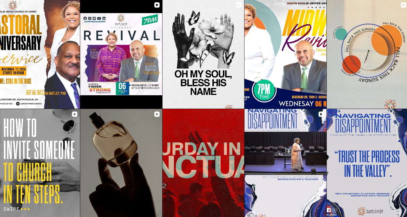
ABOVE: THE ORGANIZATIONS INSTAGRAM FEED BEFORE THE REDESIGN. 

the results

a brand that’s faster to produce, easier to recognize, and significantly more consistent across every touchpoint.

Less time designing from scratch. More clarity, visibility, and recognition across the board.

From confusion to clarity.

built as a system, not a one-off design.

A collage of eight images featuring church and community event visuals, including people holding signs, promotional posters for meetings and events, a modern church building, and a person holding a mug with a motivational quote.
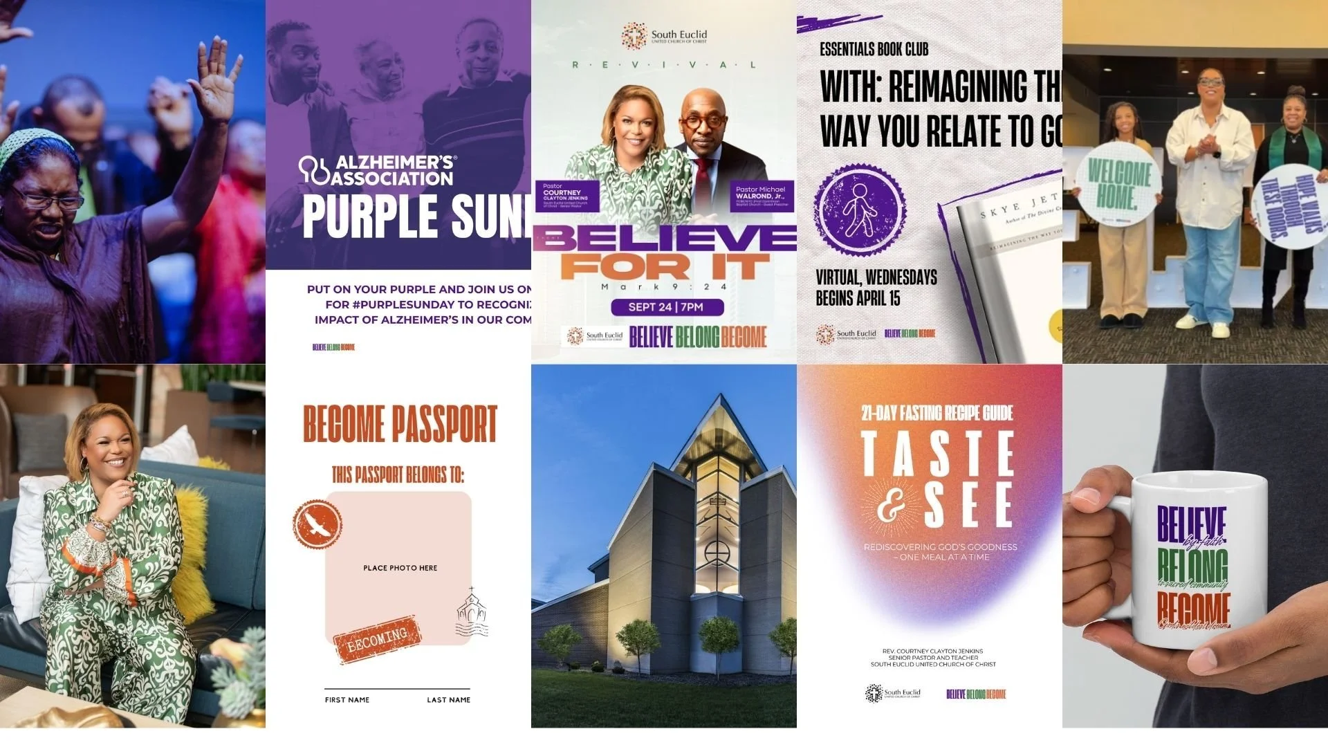
ABOVE: THEIR FEED AND MATERIALS AFTER THE BRAND SYSTEM. 
Screenshot of a document titled "Believe. Belong. Become. Brand Guidelines Document & Files" outlining brand purpose, visual guidelines, and mission statements for South Euclid United Church of Christ.
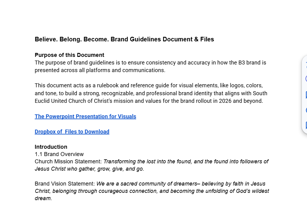
BRAND SYSTEM GUIDE AND DOCUMENTATION FROM SPOOKISERVICES.
A diagram titled 'Secondary Color Palette' showing five colored circles labeled Lilac, Mint, Peachy Keen, Black, and White. Lilac is purple, Mint is green, Peachy Keen is orange, Black is black, and White is white. The circles include their corresponding hex, RGB, and CMYK color codes. Below the circles, labels indicate usage for 'Accent colors, backgrounds, overlays, etc.' for the first three and 'Text, accents, etc.' for Black and White.